
Scatter Plots Worksheet, Examples, and Definition
Get the free Scatter Plots Worksheet and other resources for teaching & understanding solving Scatter Plots Worksheets

Key Points about Scatter Plots
- Scatter plots use dots to represent values for two different variables and are used to observe relationships between them.
- The form, direction, and strength of the association between variables can be identified by examining the pattern of the dots on the plot.
- Scatter plots are useful for identifying trends and patterns in large datasets, as well as for identifying outliers.
What is a Scatter Plot?
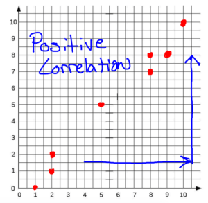
Scatter Plots are graphic representations of the relationship between two variables. Scatter Plots are a good way to look at the correlation between the two variables. The correlation of a Scatter Plot can be three different things. There can be a positive correlation, a negative correlation, and no correlation. A positive correlation means that the variables are related in such a way that they behave similarly. A negative correlation means that the variables are oppositely related. No correlation means that the variables do not seem to have a correlation at all. Use the quiz below to try some practice with scatter plots questions or download the scatter plot worksheet to the right of this page.
Scatter plots are a type of data visualization that is commonly used to observe relationships between two different variables. They use dots to represent values for each data point, with the position of each dot on the horizontal and vertical axis indicating the values for each variable. Scatter plots are useful for identifying patterns and trends in data, as well as for identifying any outliers that may be present.
To read a scatter plot, one must understand the relationship between the two variables being plotted. If the dots on the plot form a linear pattern, it indicates that there is a strong correlation between the variables. A positive correlation means that as one variable increases, the other variable also tends to increase. A negative correlation means that as one variable increases, the other variable tends to decrease.
Scatter plots can be used in a variety of fields, including finance, healthcare, and social sciences. They are particularly useful for identifying trends and patterns in large datasets, as well as for identifying any outliers that may be present. Understanding how to interpret scatter plots is an important skill for anyone who works with data.
Common Core Standard: 8.SP.3
Related Topics: Lines of Best Fit
Return To: Home, 8th Grade

How to Read Scatter Plots
Scatter plots are a type of graph that displays the relationship between two variables. They are useful in identifying patterns and trends in data. In this section, we will discuss the basic form of scatter plots and the variables used in them.
Basic Form of Scatter Plots
Scatter plots are made up of points that are plotted on a graph. The horizontal axis (x-axis) represents the independent variable, while the vertical axis (y-axis) represents the dependent variable. Each point represents the value of both variables for a single data point.
The form of a scatter plot can vary depending on the data being plotted. However, most scatter plots have a few common characteristics. For example, the points on the graph may form a pattern, such as a straight line, curved line, or cluster. The pattern can indicate a relationship between the variables.
Variables in Scatter Plots
Scatter plots use two variables: the independent variable and the dependent variable. The independent variable is plotted on the x-axis, while the dependent variable is plotted on the y-axis.
The independent variable is the variable that is being controlled or manipulated in the experiment. It is also known as the predictor variable. The dependent variable is the variable that is being measured or observed. It is also known as the response variable.
When analyzing a scatter plot, it is important to understand the relationship between the variables. If the points on the graph form a pattern, it can indicate a relationship between the variables. For example, if the points form a straight line, it can indicate a linear relationship between the variables. If the points form a cluster, it can indicate a non-linear relationship.
In conclusion, scatter plots are a useful tool for analyzing the relationship between two variables. By understanding the basic form of scatter plots and the variables used in them, you can interpret the data and identify patterns and trends.
Scatter Plots and Correlation
Scatter plots are a useful way of visualizing the relationship between two variables. They help us to identify any patterns or trends in the data and to determine whether there is a correlation between the two variables. Correlation refers to the strength and direction of the relationship between two variables. In this section, we will discuss the different types of correlation and how to interpret them.
Positive Correlation
A positive correlation exists when the two variables increase or decrease together. In other words, as one variable increases, the other variable also increases. This type of correlation is often referred to as a direct relationship. For example, there is a positive correlation between a person’s age and their income. As a person gets older, they tend to earn more money.
Negative Correlation
A negative correlation exists when the two variables move in opposite directions. In other words, as one variable increases, the other variable decreases. This type of correlation is often referred to as an inverse relationship. For example, there is a negative correlation between the amount of exercise a person gets and their weight. As a person exercises more, their weight tends to decrease.
Strong Correlation
A strong correlation exists when the relationship between the two variables is very close. The data points tend to cluster closely around a straight line. A perfect positive correlation has a correlation coefficient of +1. A perfect negative correlation has a correlation coefficient of -1.
Weak Correlation
A weak correlation exists when the relationship between the two variables is not very close. The data points tend to be scattered around the plot. A correlation coefficient close to zero indicates a weak correlation.
No Correlation
When there is no relationship between the two variables, we say that there is no correlation. The data points tend to be scattered randomly around the plot. A correlation coefficient of zero indicates no correlation.
In summary, scatter plots are a useful tool for visualizing the relationship between two variables. Correlation refers to the strength and direction of the relationship between the variables. Positive correlation exists when the two variables increase or decrease together, while negative correlation exists when the two variables move in opposite directions. Strong correlation exists when the relationship between the two variables is very close, while weak correlation exists when the relationship is not very close. When there is no relationship between the variables, we say that there is no correlation.
Types of Scatter Plots
Scatter plots are a visual representation of the relationship between two variables. They are used to observe and analyze the correlation between two sets of data. There are different types of scatter plots depending on the relationship between the variables.
Linear Relationships
A linear relationship is a type of scatter plot where the data points form a straight line. The line of best fit or trend line is used to represent the relationship between the variables. The line is drawn in such a way that it minimizes the distance between the data points and the line. The slope of the line indicates the direction and the steepness of the relationship. If the slope is positive, it means that the variables have a positive correlation, and if the slope is negative, it means that the variables have a negative correlation.
Nonlinear Relationships
A nonlinear relationship is a type of scatter plot where the data points form a curve. The relationship between the variables is not linear and cannot be represented by a straight line. There are different types of nonlinear relationships, such as logarithmic, exponential, and power. In a logarithmic relationship, one variable increases or decreases at a decreasing rate, while the other variable increases or decreases at an increasing rate. In an exponential relationship, one variable increases or decreases at an increasing rate, while the other variable increases or decreases at a decreasing rate. In a power relationship, one variable increases or decreases at a constant rate, while the other variable increases or decreases at a changing rate.
Curved Relationships
A curved relationship is a type of scatter plot where the data points form a curve that changes direction. The relationship between the variables is not linear and cannot be represented by a straight line. The curve can be concave or convex, depending on the nature of the relationship. A concave curve indicates a decreasing rate of change, while a convex curve indicates an increasing rate of change. In some cases, the curve may change direction multiple times, indicating different types of relationships between the variables.
In summary, scatter plots are used to observe and analyze the relationship between two variables. There are different types of scatter plots depending on the nature of the relationship. Linear relationships are represented by a straight line, while nonlinear and curved relationships are represented by a curve. Understanding the different types of scatter plots can help in interpreting and analyzing data.
3 Simple Scatter Plots Examples
Scatter plots are a powerful tool to visualize the relationship between two numerical variables. They can help identify patterns, trends, and outliers in the data.
- Plot all of the coordinates that are in a given set of data.
- Determine the correlation of the scatter plot by looking at the relationship of the variables.
- If the variables are positively related, the correlation is positive.
- If the variables are negatively related, the correlation is negative.
- If the variables have no relationship, there is no correlation.
Here are a few examples of how scatter plots can be used:
Regression Analysis
Scatter plots are often used in regression analysis to evaluate the fit of a model. The scatter plot can help identify if there is a linear relationship between the two variables and if there are any outliers that may affect the regression line. The regression line is a line of best fit that can be used to predict the value of the dependent variable based on the value of the independent variable.
Slope
The slope of the regression line can be used to determine the strength and direction of the relationship between the two variables. A positive slope indicates a positive relationship, while a negative slope indicates a negative relationship. A slope of zero indicates no relationship between the two variables.
Line Plots
Scatter plots can also be used to create line plots. A line plot is created by connecting the points on the scatter plot with a line. This can help visualize the trend in the data over time or another continuous variable.
Examples
Here are a few examples of scatter plots:
-
Body Mass Index (BMI) and body fat percentage of adolescent girls. This scatter plot can be used to evaluate the relationship between BMI and body fat percentage and to identify any outliers that may affect the regression line.
-
Temperature and ice cream sales. This scatter plot can be used to evaluate the relationship between temperature and ice cream sales and to identify any patterns or trends in the data.
-
Height and weight of a sample of adults. This scatter plot can be used to evaluate the relationship between height and weight and to identify any outliers that may affect the regression line.
Overall, scatter plots are a useful tool for visualizing the relationship between two numerical variables. They can help identify patterns, trends, and outliers in the data and can be used to create regression lines and line plots.
5 Quick Scatter Plots and Trend Lines Practice Problems
What are Scatter Plots used for?
Scatter plots are used to visualize the relationship between two variables. They are a useful tool for data analysis and are commonly used in various fields such as finance, science, and social sciences. Here are some of the ways scatter plots are used:
Heatmaps
Heatmaps are a type of scatter plot that uses color to represent the density of data points in a specific area. They are useful for visualizing large datasets and identifying patterns in the data. Heatmaps can be used to analyze anything from website traffic to customer behavior.
Bubble Charts
Bubble charts are another type of scatter plot that uses the size of the data points to represent a third variable. They are useful for visualizing complex data and can be used to analyze anything from stock market trends to population growth.
Scatter Plot Scaling
Scaling is an important aspect of scatter plots. Scaling the axes correctly can help to reveal patterns and relationships that may not be immediately apparent. It is important to choose the appropriate scaling for the data being analyzed.
Color and Marker Options
Color and marker options are important when creating a scatter plot. They can be used to represent different categories or groups within the data. RGB and RGBA color options can be used to create custom color schemes and highlight specific data points.
Hypothesis Testing with Scatter Plots
Scatter plots can be used to test hypotheses and make predictions about the data. They can be used to identify outliers and anomalies in the data, which can then be further analyzed to determine their significance.
Scatter Plots in Real-World Data
Scatter plots are used in a wide range of real-world applications. They are used in finance to analyze stock market trends, in science to analyze experimental data, and in social sciences to analyze survey data. They are a powerful tool for visualizing and analyzing complex data and can be used in almost any field that involves data analysis.
In conclusion, scatter plots are a versatile tool for visualizing and analyzing data. They can be used to identify patterns and relationships in the data, test hypotheses, and make predictions about future trends. By understanding the different types of scatter plots and their applications, analysts can gain valuable insights into their data and make more informed decisions.
Scatter Plots Definition
A scatter plot is a graphical representation of a set of data points showing the relationship between two variables. It is also known as a scatter chart or scatter graph. In a scatter plot, each data point is represented by a dot, and the position of the dot on the horizontal and vertical axes indicates the values of the two variables for that data point.
The purpose of a scatter plot is to visualize the relationship between two variables and to identify any patterns or trends in the data. It is commonly used in statistics, data analysis, and scientific research to explore and analyze data sets.
To create a scatter plot, the two variables are plotted on the horizontal and vertical axes, respectively. The independent variable is usually plotted on the x-axis, while the dependent variable is plotted on the y-axis. Each data point is then plotted at the intersection of the corresponding x and y values.
Scatter plots can be used to identify several types of relationships between two variables, including positive, negative, or no correlation. A positive correlation means that as the values of one variable increase, the values of the other variable also increase. A negative correlation means that as the values of one variable increase, the values of the other variable decrease. No correlation means that there is no relationship between the two variables.
In summary, a scatter plot is a powerful tool for visualizing the relationship between two variables and identifying patterns or trends in the data. By plotting data points on a two-dimensional graph, researchers can quickly and easily analyze large data sets and draw meaningful conclusions.
Interpreting Scatter Plots
Scatter plots are a powerful tool for visualizing the relationship between two variables. Understanding how to interpret scatter plots is essential for drawing meaningful conclusions from data.
Data Points
Each point on a scatter plot represents an individual data point. The horizontal axis represents one variable, and the vertical axis represents the other variable. The position of each point on the plot corresponds to the values of these variables for that data point.
Large and Small Scatter Plots
The size of a scatter plot can affect how easy it is to interpret. Large scatter plots with many data points can be difficult to read and may require additional data analysis techniques. Small scatter plots with only a few data points may not provide enough information to draw meaningful conclusions.
Outliers
Outliers are data points that fall outside of the expected range for the variables being plotted. Outliers can have a significant impact on the interpretation of a scatter plot. They may indicate errors in the data or suggest that there is a relationship between the variables that is not apparent when looking at the rest of the data.
Describing Scatter Plots FAQ
What are the three types of scatter plot?
The three types of scatter plot are linear, non-linear, and cluster. The linear scatter plot shows a linear relationship between two variables, while the non-linear scatter plot shows a non-linear relationship between two variables. The cluster scatter plot shows the presence of clusters in the data.
How to interpret a scatter plot with regression line?
A scatter plot with a regression line shows the relationship between two variables. The regression line is a straight line that best fits the data points. The slope of the regression line indicates the direction and strength of the relationship between the two variables. If the slope is positive, there is a positive relationship, and if the slope is negative, there is a negative relationship. The closer the data points are to the regression line, the stronger the relationship between the two variables.
When to use a scatter plot vs bar graph?
A scatter plot is used to show the relationship between two variables, while a bar graph is used to compare different categories. If the data has two continuous variables, a scatter plot is more appropriate. If the data has one continuous variable and one categorical variable, a bar graph is more appropriate.
Which type of features can be plotted on a scatter plot?
Scatter plots are used to plot two continuous variables. The variables can be numerical or ordinal. The variables can be independent or dependent.
What are the four characteristics of a scatter plot?
The four characteristics of a scatter plot are form, direction, strength, and outliers. The form of a scatter plot refers to the shape of the data points. The direction refers to the direction of the relationship between the two variables. The strength refers to how closely the data points are clustered around the regression line. The outliers are data points that are far away from the other data points.
How do you interpret a scatter plot?
To interpret a scatter plot, one needs to look at the form, direction, strength, and outliers of the data. The form of the data indicates the shape of the data points. The direction indicates the direction of the relationship between the two variables. The strength indicates how closely the data points are clustered around the regression line. The outliers are data points that are far away from the other data points.
What does a scatterplot tell us about data?
A scatter plot tells us about the relationship between two variables. It tells us if there is a relationship between the two variables, and if there is, it tells us the direction and strength of the relationship. It also tells us if there are any outliers in the data.
Scatter Plots Worksheet Video Explanation
Watch our free video on how to make a Scatter Plot. This video shows how to solve problems that are on our free Scatter Plots worksheet that you can get by submitting your email above. Our worksheet shows numerous Scatter Plot examples that will help you better understand Scatter Plots.
Watch the free Scatter Plots video on YouTube here: Scatter Plots Worksheet
Video Transcript:
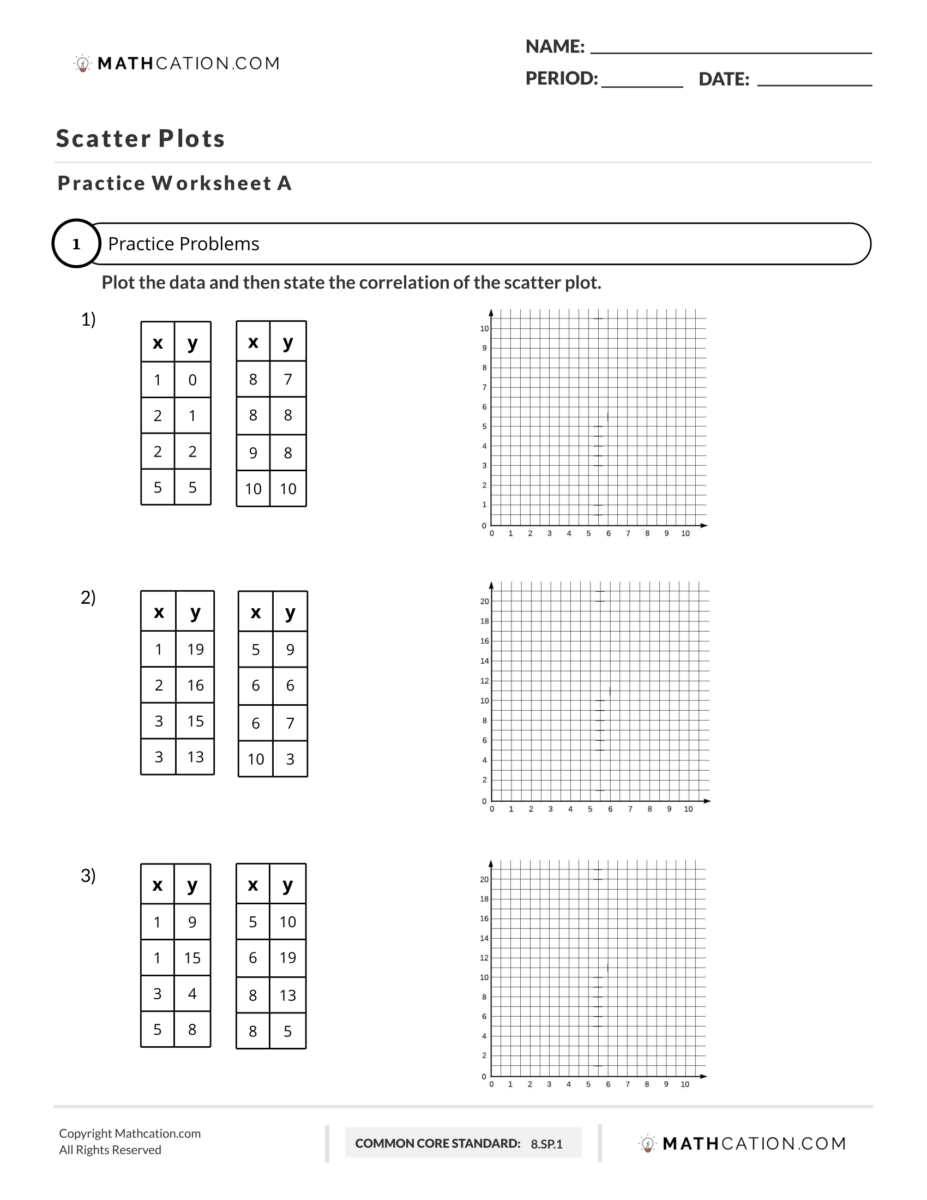
In this video we’re going to show you how to create a scatter plot and state the correlation of that scatter plot by using our free scatter plots worksheets. Let’s jump to number one. Here we are at number one and the directions say plot the data and then state the correlation of the scatter plot. In order to do this what we have to do is we have to take the numbers from our tables here and we have to plot them into our graph and create a scatter plot. If you look at our table all of our x coordinates or all of our x values here will translate into x coordinates along the x axis which is the horizontal axis. All of the numbers in the y column will core layer will translate into values along the y axis which is the vertical axis.
In the case of our first coordinate which is right here and it’s x is 1 y 0 or the coordinate 1 0 that means our x value is 1. Our x value is right here and then our Y value is 0. We will go over one on the x axis and we will stay at zero for the y axis, that’s our first point right there. Our second coordinate is X is 2 y is 1. We will go to our x axis which is this horizontal line we will go over to 2 and then for the Y we will go up to 1. We have 2 here and then we go up to 1. We’ll plot our point right there our next coordinate is X is 2 y is 2. Once again we will over to 2 for X but this time we will go up to 2 for y and we’ll plot our new point.
We’re going to go ahead and fast forward and plot all of these points for you real quick. Our data is now plotted into our scatter plots and now we have our scatter plot and this is the visual representation of the data that’s located in this table. You can see we start here at the bottom and as we go right or as we go this way to the right we go up. As we go to the right our plots increase where they go up when we talk about the correlation.
The correlation can either be one of three things it can have a positive correlation a negative correlation or no correlation or none. We’ll say none okay in the case of this example as we go from left to right our values increase. As we go from this way our values go up. We’re going up okay because we are going up that means the correlation between these two would be positive. Our answer is positive.
If we were going down or as we’re from left to right if we went down that would be negative. And then if there was no pattern if it didn’t look like there was any pattern that would be none, but in the case of this example our answer is positive or a positive correlation. Try the rest of the problems by downloading the scatter plot worksheet with answers pdf on the right hand side of this page.
Free Scatter Plots worksheet download
Practice makes Perfect.
We have hundreds of math worksheets for you to master.
Share This Page